A bookshelf is far more than a simple storage unit—it’s a statement piece that can define the personality of your living room, home office, or bedroom. As Cicero once said, “A room without books is like a body without a soul.” Yet, with so many design possibilities, styling bookshelves often feels overwhelming. Do you match every book spine? Should you mix in photos? How do you avoid clutter while still making it feel lived-in?
In this guide, we’ll demystify the art of bookshelf styling with 14 practical, reader-tested ideas tailored to U.S. homeowners. Whether you’re working with a sleek IKEA Kallax unit or a vintage heirloom bookcase, these tips will help you create a display that’s both functional and Instagram-worthy. Forget the fear of “too busy” or “too bare”—we’re turning your shelves into a curated extension of your style, one intentional layer at a time. Let’s dive in.
Master the Magic of Color Blocking
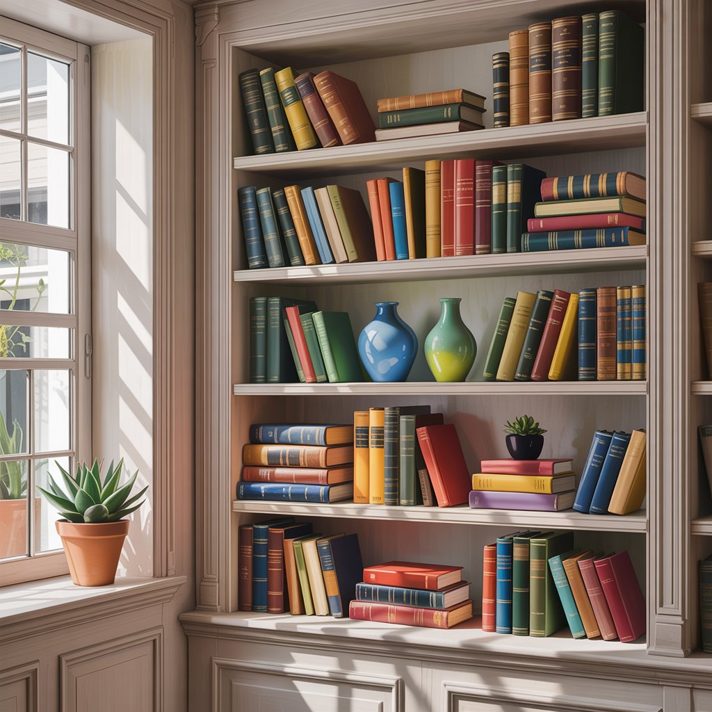
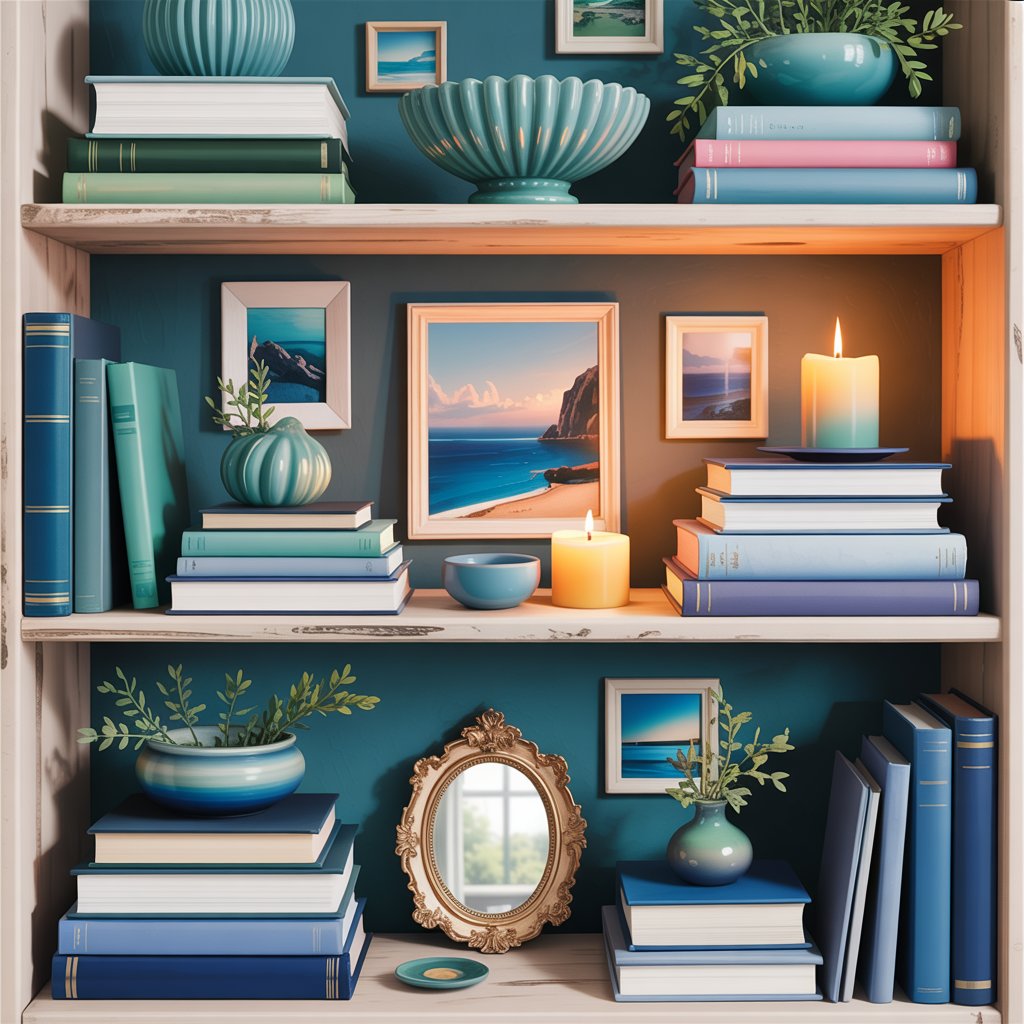
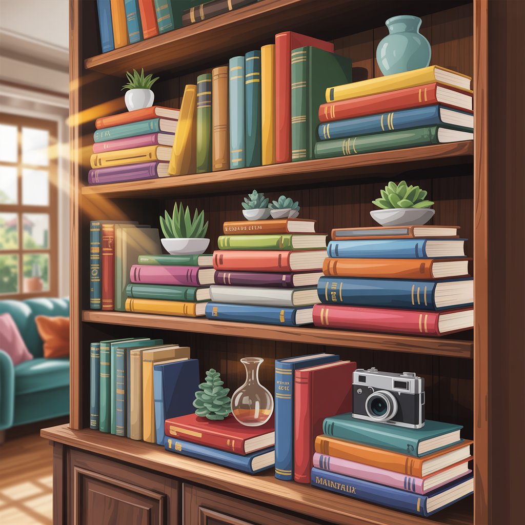
Color coordination is one of the most powerful shelf styling tricks for achieving instant cohesion. Group books by hue—soft neutrals on one shelf, jewel tones on another—to create visual rhythm without rigidity. This approach prevents the “rainbow chaos” effect, where mismatched spines compete for attention. For a modern twist, try tonal gradients: arrange books from light pastels to deep blues or earthy tans to espresso browns.
The key is subtlety. Don’t force every shelf to follow the same palette—allow one or two shelves to break the pattern with intentional pops of contrast. As coohom.com notes, “sticking to a color palette instantly elevates shelves from cluttered to curated.” This technique works especially well in minimalist or Scandinavian-inspired spaces, where harmony matters more than maximalism.
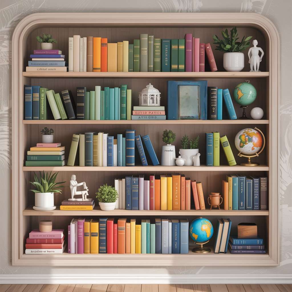
Pro Tip: Place darker books at the bottom shelves—they anchor the display visually, mimicking how nature grounds lighter elements (like tree branches) above heavier ones (trunks).
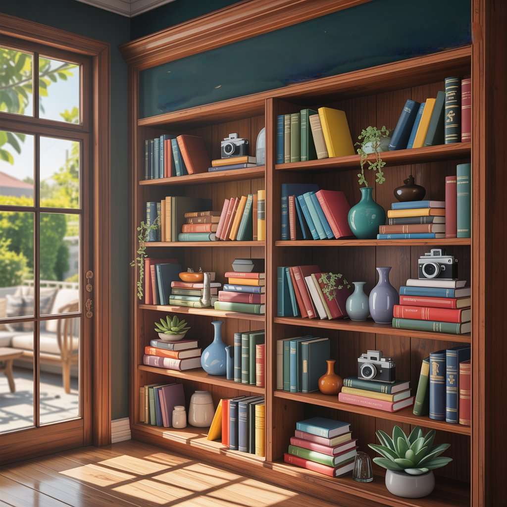
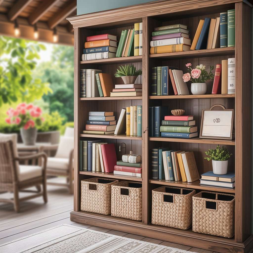
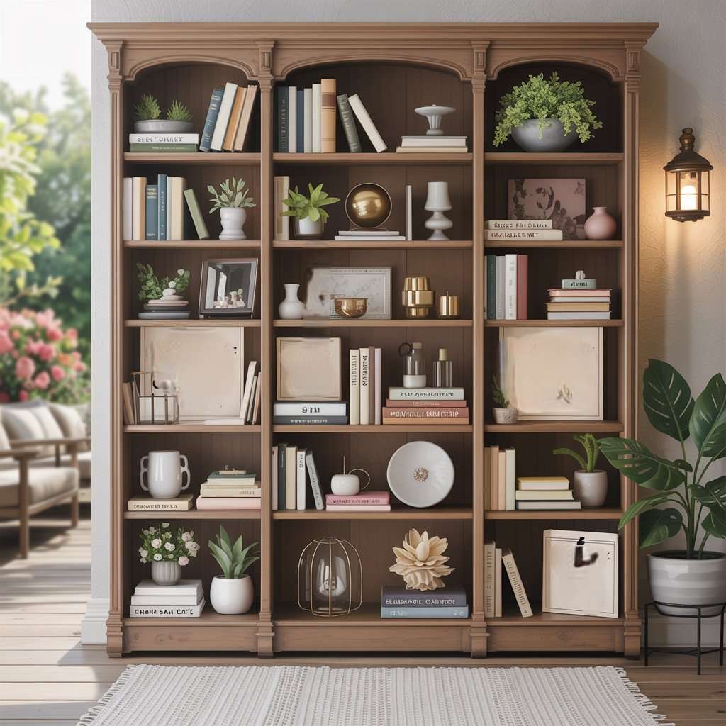
Mix Books and Decor for Dynamic Layers
Styling shelves is all about telling a story, not just storing books. Alternate books with decorative objects like ceramic vases, woven baskets, or framed family photos to add depth and personality. Lean a small piece of artwork against the back panel for an instant gallery wall effect. Remember: books are the base layer, while decor pieces become the “jewelry” of your shelf.
Avoid placing identical objects side-by-side (e.g., two matching candlesticks). Instead, vary heights and textures—pair a short wooden statue with a tall glass jar. As emphasized by byannasophie.com, bookshelves should feel like “a curated extension of your personality,” not a library catalog. This mix-and-match method also hides mismatched book heights, making your collection look intentional rather than haphazard.
Pro Tip: Use books as pedestals—stack two horizontally and place a small plant on top to elevate decor without extra shelf space.
Leave Room for Negative Space
In the battle against cluttered shelves, negative space is your secret weapon. Reserve 20–30% of each shelf empty to let your eye rest and highlight key pieces. Overstuffing books and decor creates visual stress, making even beautifully arranged shelves feel chaotic. Try the “triangle rule”: group three objects together (e.g., a book stack, a plant, and a framed photo), leaving ample space around them.
This minimalist approach resonates with the growing “quiet luxury” trend in U.S. home design. As elegantsi.com warns, poorly styled bookshelves can lead to “overflowing, cluttered, and attention-competing busy-ness.” Strategic emptiness doesn’t mean boring—it means giving your focal points room to breathe. Ideal for small spaces or modern apartments craving calm.
Pro Tip: Place empty shelves at eye level—it draws attention to your most cherished decor while creating an airy feel.
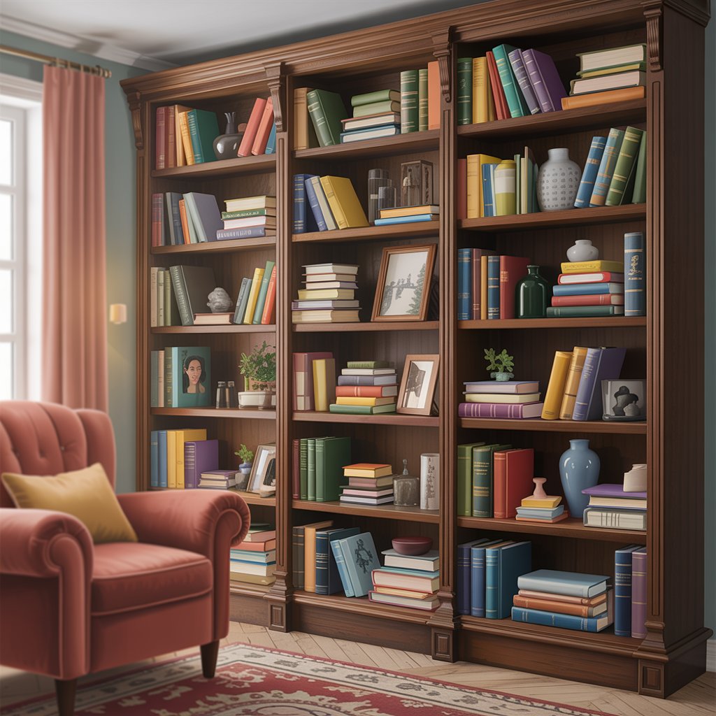
Curate a Mini Gallery Wall on Shelves
Turn your bookshelf into a 3D gallery by integrating framed art, photo collages, or even fabric swatches. Alternate vertical book stacks with small artworks (8×10″ or smaller) to mimic museum-style displays. For added dimension, choose frames with varying materials—thin black metal for contrast, rustic wood for warmth. Lean multiple frames against the back panel for a casual vibe.
This idea shines in living rooms or entryways where wall space is limited. homedecorfull.com suggests mixing “books of different sizes and colors with framed photos, artwork, and decorative objects” to create elegance in any room. Pro tip: align the center of your top frame with the top of your tallest book to maintain balance.
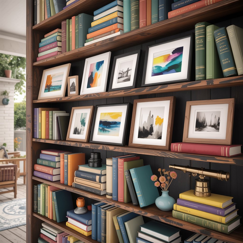
Pro Tip: Use removable adhesive strips instead of nails to swap art seasonally—no damage to walls or shelves.
Anchor Shelves with Statement Bookends
Ditch boring metal bookends! Elevate functionality into art with sculptural pieces that reflect your style—think marble geodes, vintage ceramics, or hand-carved wood. Place matching bookends at the ends of a single shelf to frame your display, or use mismatched ones for playful eclecticism (e.g., a brass elephant on one side, a woven rope coil on the other).
Bookends aren’t just for holding books upright—they’re conversation starters. The artsample.com guide highlights how the right accessories “enhance the overall aesthetic while keeping [shelves] organized and functional.” For a luxe touch, stack books vertically between two large bookends to create a hidden “drawer” for remotes or notebooks.
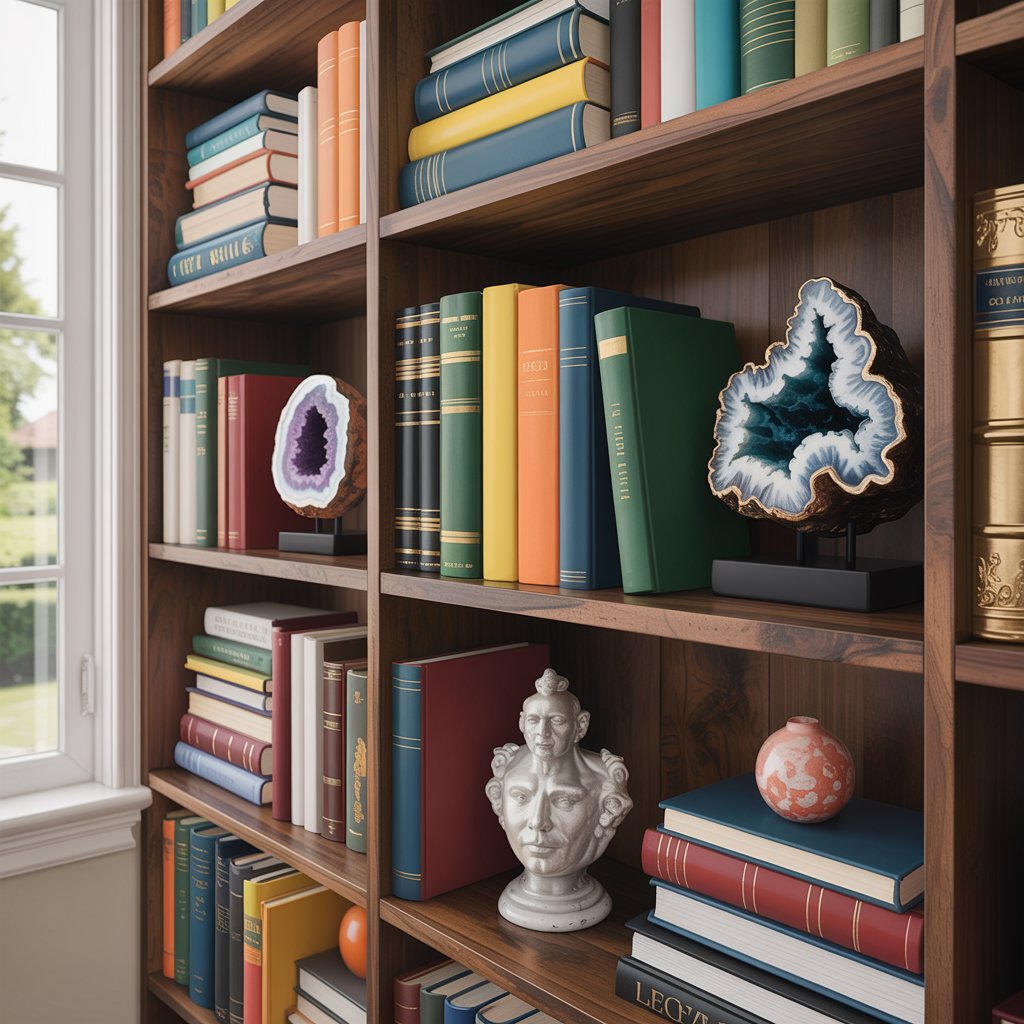
Pro Tip: Repurpose unexpected items—wine stoppers, toy cars, or seashells—to line up along the front edge of shelves for whimsy.
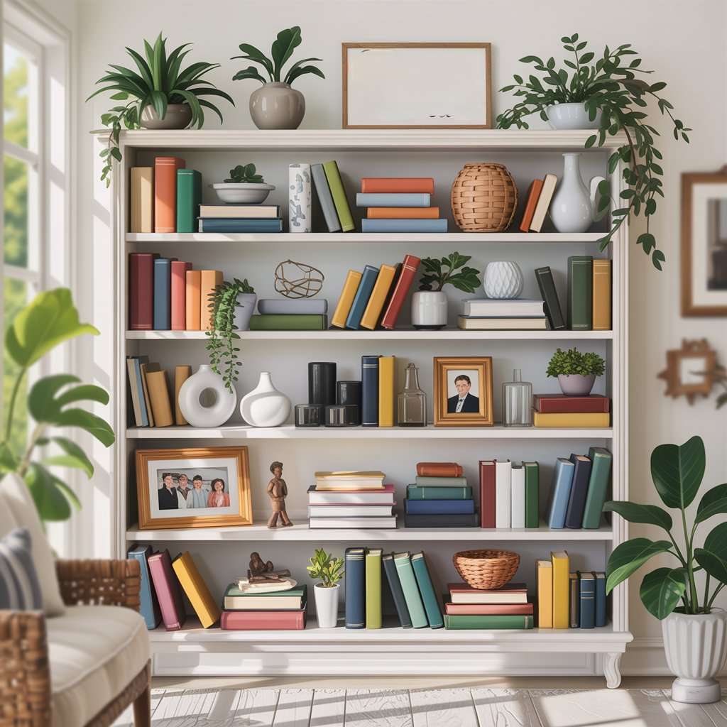
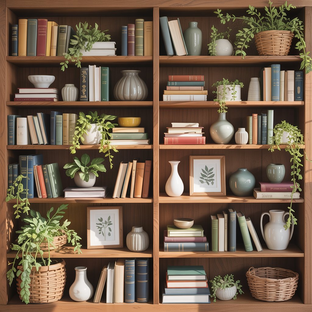
Incorporate Lush Greenery for Life
Plants breathe vitality into static book displays. Opt for low-maintenance varieties like snake plants or ZZ plants in small pots—they thrive in shelf light conditions and add organic contrast to rigid book spines. Place trailing pothos or philodendrons on upper shelves so their vines cascade downward, softening hard edges.
Greenery also solves a common problem: when books dominate, shelves feel sterile. As interior designers observe, “natural elements bridge the gap between curated and lived-in” (a principle echoed across elegantsi.com). For renters or those with limited sunlight, faux plants (like those from Anthropologie) offer realistic texture without upkeep.
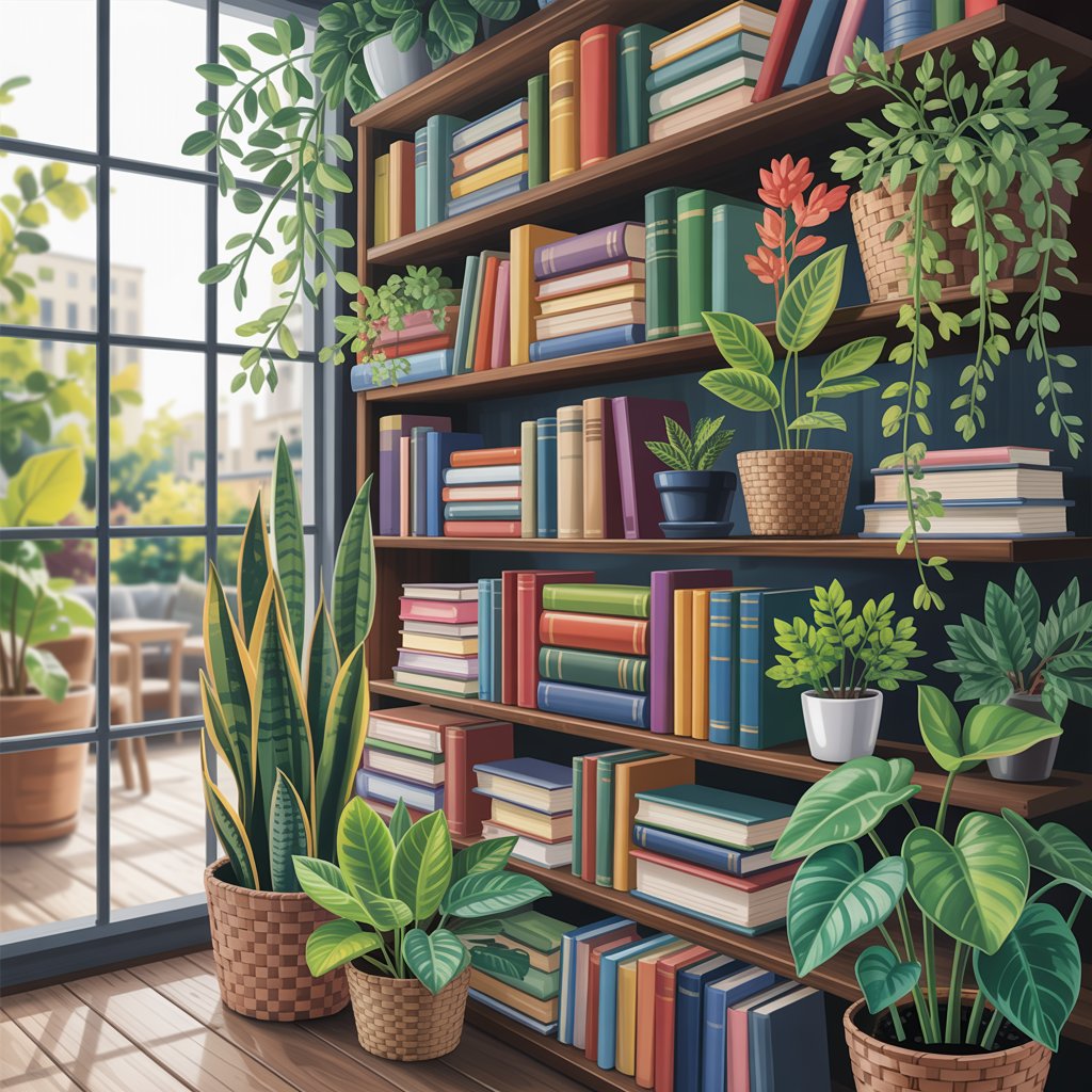
Pro Tip: Nest plants in woven baskets to hide plastic pots and add texture—perfect for bohemian or Japandi styles.
Layer Objects for Depth Like a Pro
Flat arrangements look staged. Create depth by positioning taller items at the back, mid-height in the center, and small decor forward. Example: a stack of three books (back row) + a ceramic bowl (middle) + a single candle (front). This technique mimics how museums display artifacts, guiding the eye through layers rather than single points.
For maximalist energy without chaos, use the “rule of threes”: group related items (e.g., blue book stack, navy throw, and ocean photo) to create mini-zones. byannasophie.com reminds us that shelves should “set a mood and add soul to your space”—layering achieves this by making static objects feel dynamic.
Pro Tip: Tuck a small mirror behind stacks to reflect light and double the perceived depth of shallow shelves.
Alternate Book Orientation for Visual Rhythm
Stand all books vertically? You’re missing a beat. Horizontal stacks break monotony—place three or four books flat to create platforms for small decor. Alternate between vertical spines and horizontal stacks every other shelf to build rhythm. Try placing taller hardcovers upright beside shorter paperbacks laid flat for contrast.
This trick is ideal for shelves with uneven book heights. Interior designers note that mixed orientations prevent the “library catalog” effect, making personal collections feel intentional. As homedecorfull.com advises, shelves should showcase “your personal style”—not just hold books.
Pro Tip: Use horizontal stacks to hide unattractive book tops (like dog-eared pages) while displaying beautiful spines.
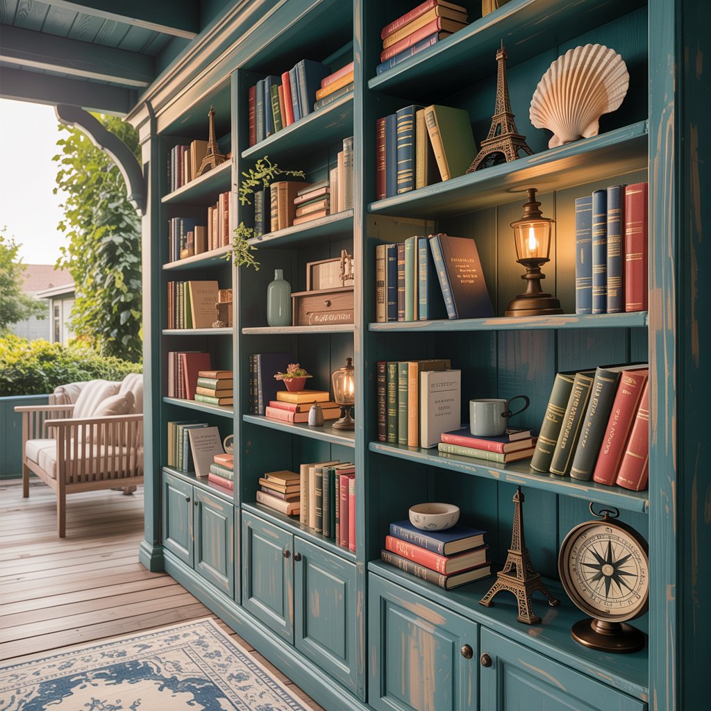
Feature Personal Keepsakes as Conversation Starters
Your shelves should tell your story. Display travel souvenirs (a seashell from Cape Cod, a miniature Eiffel Tower), childhood mementos (your grandfather’s compass), or hobby items (knitting needles beside craft books). Cluster 3–5 meaningful objects together to create a “memory vignette” that sparks connection.
This idea transforms sterile shelves into emotional anchors. As elegantsi.com stresses, designers always ask “how [clients] want to feel when they’re in this area of their home.” For U.S. homeowners, sentimental touches—like college diplomas framed between books—add warmth Modern Farmhouse or Mid-Century spaces often lack.
Pro Tip: Rotate keepsakes seasonally (e.g., swap beach finds for ski pins to keep shelves feeling fresh).
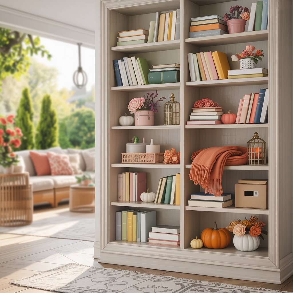
Rotate Seasonal Decor for Year-Round Appeal
Keep shelves fresh and engaging by swapping accents with the seasons. Spring: pastel linen boxes and pressed flowers. Summer: woven trays and coral pieces. Fall: mini pumpkins and warm-toned throws. Winter: faux fur rolls and metallic ornaments. The books stay year-round, but decor elements change.
This low-effort hack prevents boredom—ideal for U.S. homes that celebrate holidays. coohom.com recommends “picture[ing] different display arrangements” before styling. Use clear storage bins to keep seasonal items ready. Hint: Stick to 3 colors per season (e.g., spring = soft pink, sage, cream) for cohesion.
Pro Tip: Store off-season decor inside hollow book boxes (available on Etsy) to save shelf space.
Hide Clutter with Chic Storage Solutions
Let’s address the elephant in the room: real people need real storage. Tuck remotes, chargers, or kids’ toys inside decorative boxes labeled “Office Supplies” or “Games.” Woven seagrass bins hide杂物 while adding texture. For open shelving, choose baskets that match your shelf color (e.g., white rattan for light wood shelves).
This balances aesthetics and function—a critical need for busy U.S. households. Per elegantsi.com, “overwhelming, cluttered shelves distract from a room’s elegance.” The trick? Only 70% of your shelf should be visible—30% stays hidden but accessible. Great for family rooms where shelves double as command centers.
Pro Tip: Use magnetic chalkboard labels on bins for flexible labeling (e.g., “Holiday Decor” → “Summer Gear” with a swipe).
Add Ambient Lighting for Drama
Light transforms shelves from background to focal point. Install LED strip lights under upper shelves to cast downward glows on lower decor. Battery-operated puck lights inside book stacks highlight special editions. For vintage flair, place a small table lamp sideways on a middle shelf to illuminate artwork.
This technique elevates even modest bookcases. As noted in artsample.com’s guide, lighting is key to making shelves “an essential design element.” In darker rooms or hallways, strategic lighting can mimic the cozy ambiance of a library in a Fixer Upper-style home.
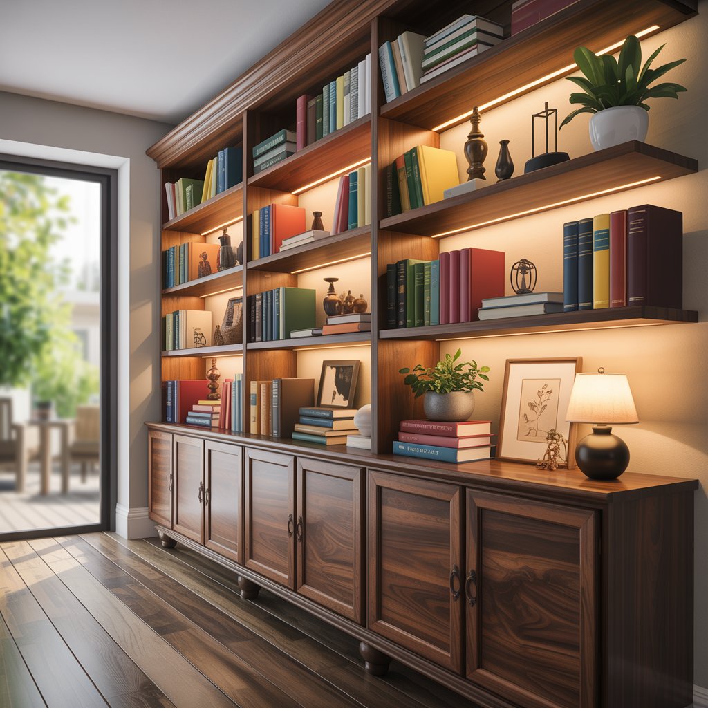
Pro Tip: Warm white bulbs (2700K) make books feel inviting; cool white (4000K) works for modern offices.
Balance Symmetry and Asymmetry
Perfect symmetry feels staged; pure asymmetry feels messy. Blend both: mirror book heights on left/right shelves but vary decor (e.g., two identical stacks with a plant on one side and a photo on the other). Or keep top shelves symmetrical (matching baskets) and go wild with lower shelves.
This hybrid approach suits American tastes—ordered enough for comfort, creative enough for personality. homedecorfull.com showcases how balanced shelves “transform space into visually appealing areas” without rigidity. Ideal for Colonial or Transitional homes craving harmony.
Pro Tip: Use a level app on your phone to ensure shelf symmetry—no more crooked displays!
Mix Materials and Textures for Richness
Uniformity is boring. Pair smooth marble bookends with rough-hewn wood statues, glossy coffee table books with matte ceramic bowls. Add metallic accents (brass, copper) to neutral shelves for subtle shine. On predominantly wood shelves? Introduce a black iron sculpture to break the grain.
Material contrast creates tactile intrigue—critical in U.S. design trends like Japandi (Japanese-Scandi fusion). As byannasophie.com suggests, shelves should have “soul,” which means avoiding one-note aesthetics. This idea works wonders in neutral palettes (beige, gray) where texture becomes the star.
Pro Tip: Place a velvet throw pillow vertically between books—it adds plushness without eating shelf space.
Essential Bookshelf Styling Checklist
| Principle | Do ✅ | Don’t ❌ |
|---|---|---|
| Spacing | Leave 30% shelf empty | Overcrowd every inch |
| Color | Stick to 3–4 main hues | Use clashing rainbow spines |
| Function | Hide clutter in stylish bins | Let remotes/dust pile up |
| Flow | Position tallest items at ends | Place heavy objects top-shelf |
Final Thought: Your Shelves, Your Story
Bookshelf styling isn’t about rigid rules—it’s about intention. As you experiment with these 14 ideas, remember the wisdom from byannasophie.com: “A room without books is like a body without a soul.” Your shelves should pulse with your energy, balancing books you love with objects that matter. Start small: pick three tips to try this weekend. Snap a before/after photo—chances are, you’ll fall in love with the transformation. After all, the best decor isn’t perfect; it’s authentically you. Happy styling!