Your living room is the heart of your home—a space where memories are made, conversations flow, and your personal style shines. But let’s face it: blank walls can make even the coziest room feel incomplete. As an interior designer specializing in US homes, I’ve seen how the right wall art instantly elevates a space from “meh” to “magnificent.” With minimalist aesthetic trends surging and bohemian-inspired styles dominating Pinterest feeds, 2025 is all about intentional yet effortless design. In this guide, you’ll discover actionable strategies used by top designers to create living room wall art that doesn’t just fill space—it tells your story. No fluff, no outdated hacks—just proven techniques backed by industry experts. Let’s turn those bare walls into your home’s greatest conversation starter.

🌿 1. Embrace the Boho-Minimalist Fusion
Mix organic textures with clean lines for relaxed sophistication. Modern US homeowners are ditching maximalism for a curated blend of bohemian earthiness and minimalist precision. Think macramé wall hangings paired with a single bold abstract print, or woven rattan mirrors alongside sleek black-and-white photography. This trend leverages nature-inspired textures while maintaining visual calm—a perfect antidote to our screen-saturated lives.
The key is intentional layering. As highlighted by ElephantStock, “Boho decor incorporates nature-inspired details with bold patterns and textiles” but avoids clutter through strategic negative space. Start with a neutral sofa, then add one statement fiber art piece above it. Anchor with a single oversized ceramic vase on a credenza—no more than three texture types per wall.

Designer Pro Tip: “Place your boldest texture at eye level (57–60 inches from floor). Let secondary elements recede into shadows—this creates depth without chaos.” – Sofia Martinez, NYC-based Interior Designer
🖼️ 2. Go Large with a Statement Canvas
Make an instant focal point with oversized art. Nothing transforms a living room faster than a large wall decor piece that commands attention. Forget matching art to furniture size—today’s trend favors intentional disproportion. A 48″x72″ canvas over a 72″ sofa creates dramatic scale, drawing eyes upward and adding luxury.
According to PaintSlab, the secret lies in how supporting elements interact: “Nothing competes with the artwork for attention, but colors, textures, and lighting complement one another perfectly.” Pair a monochrome abstract canvas with dimmable wall sconces that graze its texture. Avoid cluttering nearby surfaces—let the art breathe.

| Wall Size | Recommended Art Dimensions | Ideal Room Style |
|---|---|---|
| Under 10′ wide | 36″x48″ | Cozy Farmhouse, Studio Apartments |
| 10’–14′ wide | 48″x60″ to 60″x72″ | Mid-Century Modern, Open-Concept |
| Over 14′ wide | 72″+ wide diptych/triptych | Luxury Lofts, High-Ceiling Spaces |
⬜ 3. Master the Minimalist Monochrome
Less is more with strategic neutrals. Minimalist wall art isn’t about emptiness—it’s about intentional silence. A single black-and-white landscape in a thick white frame creates rhythm without noise, perfect for busy professionals craving calm. As SofabWallArt explains: “It’s not just about having less; it’s about making choices that enhance your space without overwhelming it.”
Focus on texture contrast within monochrome schemes. Try a matte charcoal line drawing above a glossy white console. Or hang a cream-toned woven tapestry beside smooth concrete shelves. For renters, removable canvas panels offer flexibility—swap seasons without damaging walls. Remember: minimalist art works hardest when framing matches your trim. Black frames pop against white walls; natural wood blends with warm palettes.

Pro Tip: Measure sightlines from your main seating. Art should be visible from all angles but crisp from primary viewpoints—never straining the neck.
🖼️ 4. Curate a Dynamic Gallery Wall
Tell your story through mixed-media storytelling. Gallery walls are back—but not the haphazard clusters of 2010. Today’s designs follow rhythmic grids with intentional “breathing room.” Mix family photos, vintage maps, and original sketches within a cohesive color story (e.g., all metallic frames or desert-toned mats).

Start with your largest piece as the anchor (usually above seating). Build outward using the “triangle rule”: place smaller items at 30-degree angles from the center. Architeg-Prints emphasizes mat consistency: “Elevating your art with a white mat creates uniformity across diverse pieces.” Use blue painter’s tape to mock layouts on the floor first—photograph arrangements to compare before hammering.
🌄 5. Bring the Outdoors In with Nature Prints
Connect to biophilia through organic imagery. Scientifically proven to reduce stress, nature-inspired wall art is skyrocketing in US homes. But avoid cliché forest scenes—opt for abstract botanicals or macro photography of dewdrops on leaves. For modern spaces, try black-and-white landscape triptychs; for rustic homes, pressed fern panels in shadow boxes.

Pro Tip: Hang near windows to create “visual continuity” between indoor/outdoor spaces. As ElephantStock’s design director notes, pairing earthy art with real plants doubles the calming effect—try a fiddle leaf fig beside a canvas of cracked desert soil.
🎨 6. Use Accent Walls as Art Backdrops
Let your wall frame the masterpiece. Painting one wall in a deep tone (like navy or terracotta) creates instant drama for lighter art. This technique, spotlighted by PaintSlab, makes rooms feel “comfortable and yet exciting” by directing focus to your centerpiece.

Critical rule: Ensure the accent wall color appears somewhere in your art (e.g., a burnt orange sofa in your landscape print). For small rooms, choose warm tones—it recedes visually. Always use eggshell finish; flat paint flattens dimension. Paint only the wall behind your main seating area—never full perimeter.
✨ 7. Illuminate for Drama
Lighting transforms art from decoration to experience. Install adjustable picture lights or hidden LED strips behind floating shelves. Track lighting with directional heads lets you spotlight multiple pieces. Aim for 3000K bulbs—warm enough for comfort, cool enough to prevent yellowing.

“The right lighting makes colors vibrate,” says designer Lena Chen. Pro Tip: Place lights 2.5x the art’s height above it. Too close = harsh shadows; too far = washed-out details.
📐 8. Size Matters: The Golden Ratio Guide
Follow math, not guesswork, for perfect proportions. Your art should cover 60–75% of the wall space above furniture. Use this formula:
$$ \text{Ideal Art Width} = \left( \frac{2}{3} \times \text{Furniture Width} \right) + 6 \text{ inches} $$
So for a 96″ sofa:
$$ \left( \frac{2}{3} \times 96 \right) + 6 = 70 \text{ inches} $$
| Furniture Width | Single Art Width | Gallery Wall Width |
|---|---|---|
| 72″ (love seat) | 54″ | 60″ |
| 96″ (standard sofa) | 70″ | 80″ |
| 120″+ (sectional) | 90″ | 108″ |

Never hang art smaller than 1/3 your furniture’s width—that’s the #1 mistake I fix!
🖋️ 9. Personalize with Custom Typography
Words as art reflect your values. A meaningful quote in elegant script (like “Gather” or “Breathe”) adds intimacy. For modern spaces, try sans-serif metal letters; for traditional homes, watercolor calligraphy. Key: Keep it positive and short—no novels!

Pro Tip: Match font weight to room energy. Bold fonts (Helvetica Bold) energize active spaces; delicate scripts (Cursive Watercolor) soothe bedrooms. Always use your own handwriting for ultimate authenticity—scan it for print-on-demand services.
🌈 10. Play with Unexpected Materials
Move beyond canvas into dimension. Woven tapestries, carved wood panels, or even vintage window shutters add tactile intrigue. Try a oxidized copper relief above a fireplace or a crocheted mandala in a sunroom.
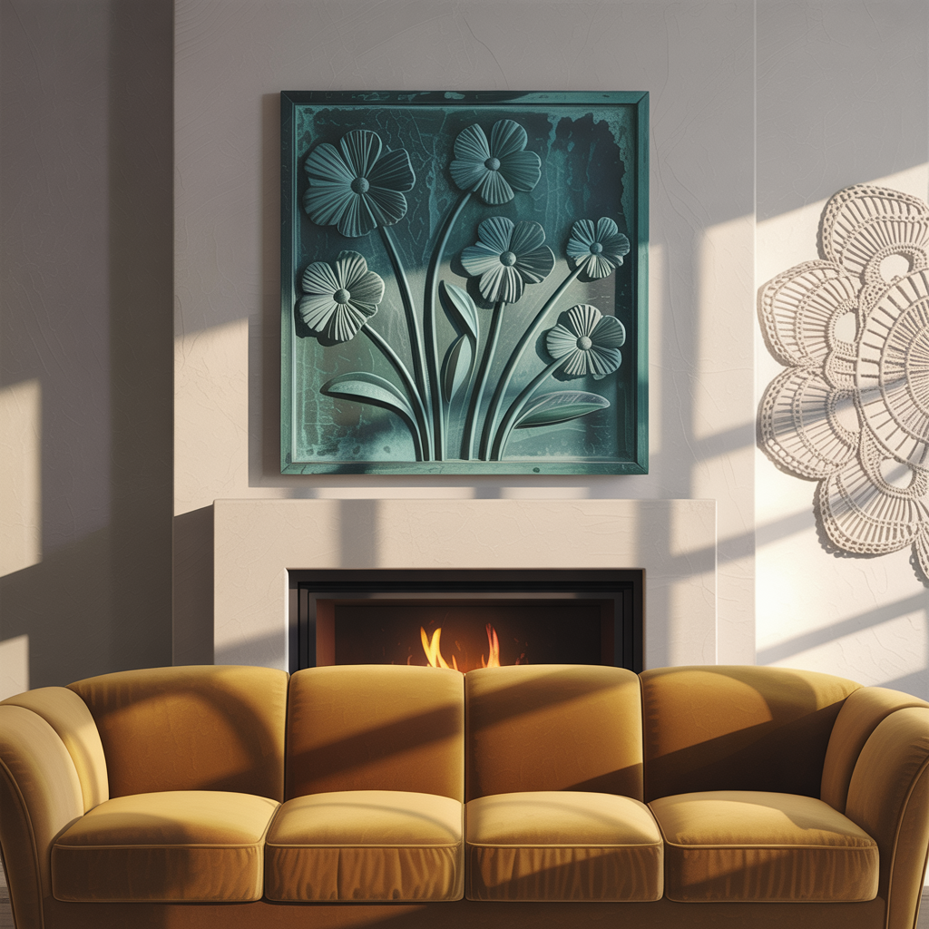
Critical reminder: Balance texture-heavy art with smooth furniture. If walls are busy, sofas should be solid-colored velvet—not patterned linen. As SofabWallArt advises, “Minimalist wall art transforms your living room into a sophisticated retreat” by avoiding sensory overload.
🔄 11. Rotate Seasonal Art Collections
Keep your space feeling fresh without renovations. Design a modular system: install floating shelves or grid wires where you swap pieces quarterly. Spring? Pastel floral prints. Fall? Mustard-hued abstracts.

Pro Tip: Store off-season art in climate-controlled containers (never basements!). Label frames with orientation arrows (↑ TOP) for easy rehanging.
🖼️ 12. Frame Like a Gallery Pro
Frames make or break expensive art. As Architeg-Prints insists: “The right frame makes all the difference.” For cohesive spaces:
- Thin black frames: Modern/Industrial
- Natural wood stains: Rustic/Scandi
- Gold leaf: Traditional/Luxury

Avoid: Matching frames to wall color—it disappears. Contrast always wins (e.g., black frame on beige wall).
🌟 13. Create Focal Points in Awkward Spaces
Fix architectural flaws with art. Narrow hallway? Hang vertical diptychs to elongate. Low ceilings? Place horizontal art just above eye level to draw sightlines outward. Behind stairs? Install a curved canvas following the rake angle.

Pro Tip: Use illusionary perspective art (like Roads & Kingdoms prints) to visually expand tight spaces—works like a mirror without the clutter.
🎭 14. Mix Old and New for Timeless Appeal
Vintage + contemporary = instant character. Pair a Renaissance reproduction with neon acrylic sculpture. Or hang a Navajo rug beside a metallic geometric print. The contrast tells a richer story than uniform aesthetics.

Rule of thumb: Keep one style dominant (70% new/30% vintage). Too equal = chaotic. Always ground vintage pieces with modern frames to prevent “dusty antique” syndrome.
💡 15. Prioritize Emotional Connection Over Trends
Your art should resonate, not just impress. That vacation photo? Blow it up. Kid’s finger painting? Frame it professionally. As ElephantStock reminds us: “Wall art is an easy way to bring class, sophistication, fun, and vibrance to any room” when it reflects your journey.

“Art isn’t decor—it’s emotional infrastructure,” says designer Marco Ruiz. Pro Tip: Before buying, sit with the piece for 48 hours. If it doesn’t spark joy and calm, return it.
Your Action Plan: From Blank Wall to Wow Factor
Transforming your living room with wall art isn’t about following rigid rules—it’s about designing with purpose. Start small: choose one strategy from this list (like upgrading frames or sizing up your canvas) and implement it this weekend. Remember Sofia Martinez’s golden rule: “Place your boldest texture at eye level—let everything else serve the story.”
“Whether you have a natural eye for design or you haven’t yet defined your home decor style—these inspiring tips will help you create the perfect designer home.” – ElephantStock
Your walls are waiting to speak. What will they say about you? For more guidance, explore these designer-approved resources: